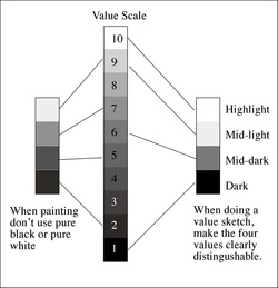
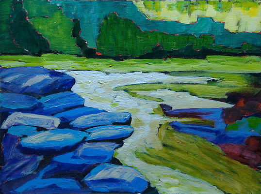
 Ask any professional painter and they will tell you that they don't paint objects, scenes or figures, they paint shapes. And to them, shapes are made up of areas of similar value. That is, how dark or light it is. In other words, what makes one shape separate from another shape is its value. There are several value scales going the rounds. Scale of one to ten with ten being white, zero to ten with ten being white. one to ten with ten being black, etc. We're using the one to ten scale with one being black and ten being white. It seems to have won out over the other scales. It's important to know which scale someone is using if they are referring to values, as you can imagine the results of a value of seven will be vastly different depending upon the scale used. You should almost never paint anything either a ten or a one. These things rarely ever occur in nature, although you might use a ten if you were depicting the tiny glint of pure light reflecting off a white or bright metal or glass object. Tiny! Black should next to never be used. In real life, there is no shadow or substance that is pure black. Using pure black is like having a hole in your painting. No light escapes. It's dull. So that leaves values two to nine. Eight values is still too many to easily separate in a scene, and if you do separate a scene into eight values, you will no longer have major shapes. Instead, you will have dozens of little, unconnected shapes, robbing your painting of strength. When you look at a scene, think along the terms of four values, five at most. 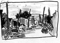 Here I've created a "Value Sketch" to help me divide the scene into the four values. While above I said no black and no white, for the purpose of your value sketch, black stands for the darkest values, white for the lightest. They don't stand for black & white.
By dividing the scene into these four values, it's so much easier to see the compositional structure. If you cannot make the scene work in this simplified arena, no amount of "fixing" it as you paint will ever make it work as a painting.. The value sketch and the resulting knowledge of where the darks, mid-tones and lights should be, helps you stay honest to the scene as you paint. If it was dark in the sketch, make sure the value is dark in the painting, no matter what the colour. Keith Thirgood www.wilsonstreetstudios.com
1 Comment
We hear this question from our students, fellow artists and each other all the time. Since we've been teaching, and during our own growth as painters, we've found that the answer to this fits into one or more of five general reasons.
Whether you're working from nature, a still life or from a photograph, you need to observe carefully. Good observation requires time and contemplation. Many artists arrive at a location, take a quick look, set up their easels and begin to dive into their painting. Walk around your subject, or if a photo, use cropping "ells" to explore different crops. Get to know your subject. Figure out what draws you to it. Look at the colours in isolation. Determine how the scene is constructed. Make sketches. Once you know what you're painting, observation doesn't stop. For every 30 seconds you spend applying paint to your surface, spend 60 to 90 seconds observing your subject. Next time I'll deal with composition. I've been on the hunt for juried art shows and juried Art in the Park style events. I've spent so much time on it, I've neglected our blog. So I decided to post what I've found in our blog. I invite you to add shows that you've heard of, where there is still time for members to sign up for.
With some of these shows, you have to join the organization hosting them, however, that's often not a real barrier. Sometimes the shows have a restricted geographic barrier. If there are any restrictions that you know of, please mention them when you list a show. If I come across any more, I'll add them to the post. artcetera 2013 Elora Centre for the Arts (ECFTA) http://www.eloracentreforthearts.ca APPLICATION DUE MARCH 8 Beaux Arts Brampton juried show http://beaux-artsbrampton.com APPLICATION DUE MARCH 8 Stratford Art in the Park http://www.artintheparkstratford.com/applicants.php APPLICATION DUE March 15 Sunnyside Beach juried art show (art in the park style)http://www.artinitiatives.ca/sunnyside/home.html APPLICATION DUE MARCH 31 Judith and Norman Alex Art Gallery https://www.jnaag.ca/about/call-for-entry-juried-art-show Application due April 4 (South west Ontario residents only) Aurora Annual Art Show & Sale http://www.town.aurora.on.ca/aurora/artshow April 15 however, once all spots are taken no more are accepted. Blue Mountain Foundation for the Arts http://www.bmfa.on.ca/applications.html APPLICATION DUE April 5 or 6 Quinte Art Council Expressions http://www.quinteartscouncil.org/events/expressions/expressions.html Due April 8 Warkworth Art in the Park http://www.warkworthartinthepark.ca/call-for-entries/ APPLICATION DUE April 12 Jazz It Up juried art show Whitby Jazz it Up APPLICATION DUE April 15 or 17 in person Art in the Park Oakville http://www.artintheparkoakville.com/apply_to_aip.html APPLICATION DUE APRIL 25 Art in the Park Petrolia http://www.artintheparkpetrolia.com/htm/vendor_app.php ASAP Schomberg Village Street Gallery http://svsg.ca/ APPLICATION DUE May 13Art in the Park Sarnia http://artintheparksarnia.com/?q=application/application-fees June 1 or as soon as all space is filled Art in the County held in Picton, Ontario http://artinthecounty.com/ APPLICATION DUE June 14 Uxbridge Art in the Park http://www.uxbridge.com/lionsart/ APPLICATION DUE August 1, however as soon as they have enough artists, they close applications I welcome you to add to this list. Cheers, Keith Thirgood President OPAS www.wilsonstreetstudios.com One of the issues I've noticed is that, for the most part, artists don't know how to photograph their artwork. Taking good quality shots of your art is important when you post them online and even more important if you are entering shots of your art for a juried art show. I was trained as a professional photographer and two-dimensional shooting was part of our training. I'll give you two approaches to shooting your art. First, the low-tech way and then the "proper" way.
Low Tech Approach To shoot your art "low tech", you need a diffuse light source and the best one around is the sun. When the sky is overcast, but still relatively bright, it's the best time to photograph your art. The following steps are taken outside in the diffuse light.
The Proper Way This is the "proper" way to shot a 2-dimensional object such as a painting. Most painters don't have the time or equipment to do it properly, however, this is the way it's done in a studio.
Cheers, Keith After working with new plein air painters over the past couple of years I've found the following tips to be helpful. Bringing order out of chaos Painting out of doors can be overwhelming. There is just too much "stuff" in front of you to make a good painting. Your first job is to simplify by eliminating all extraneous details and items.
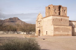 This is a shot of a typical scene. 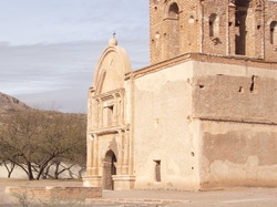 This is a crop of the same scene focusing on a focal point. 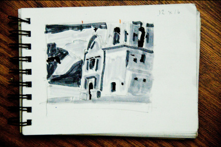 Here is a thumbnail sketch of the scene. I decided I wanted the mountain to show up in the scene so i moved it right. I also wanted more of the tower to show, so I shortened it. 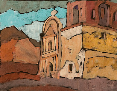 This is the final plein air painting.
Keith here today. I'm writing this from the deck of the luxury cottage we rented to run our Muskoka Art Retreat. The students have finished their three days and have gone home with their new paintings. I'm looking over the small sketches I did over the past few days and am thinking about large canvases. Once in a while one of our small works simply calls out to be enlarged. When it does, we take off our plein air hats and move into the studio, pull out a big surface and give it a go. I've done quite a few big versions of smaller works and have come up with a few "rules" to guide me:
11 x 14 to 24 x 36 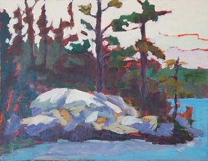
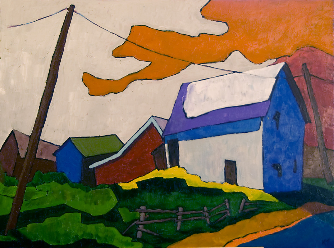
As you can see, I kicked up the colour, eliminated objects, added more power to the sky and tried to recreate the feeling I had looking at this slice of the Canadian landscape. In the following pair, I wanted to take my already somewhat loose painting and take it to an almost abstract vision. 12 x 16 to 30 x 40 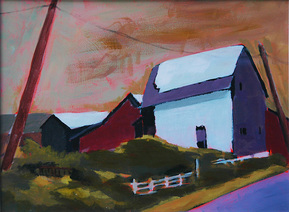
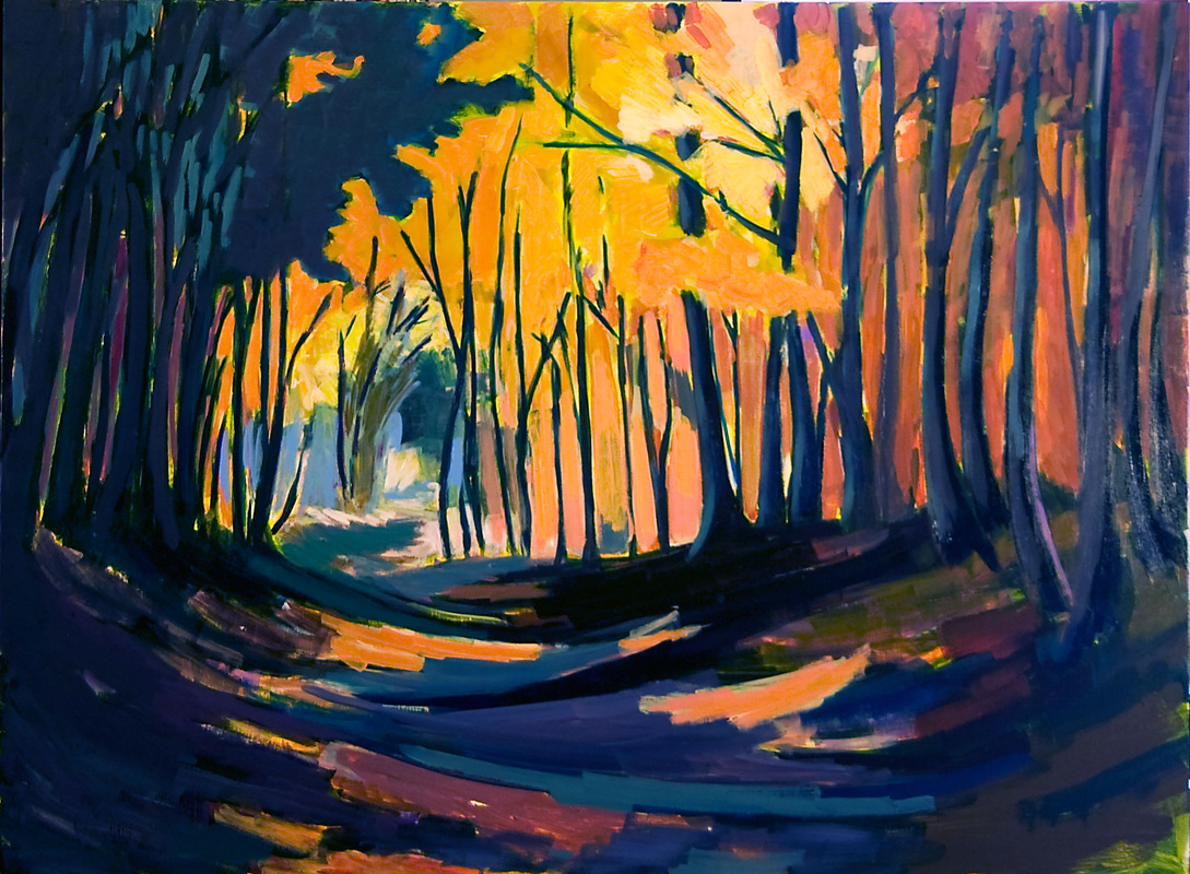
The next two paintings are by Helen. She felt she cropped the original scene too tightly and lost some of the drama of the path in the woods, so from memory and her original painting, she "backed up" and created a deeper version with more vivid colours. She tells me it's a work in progress. 12 x 16 to 30 x 40 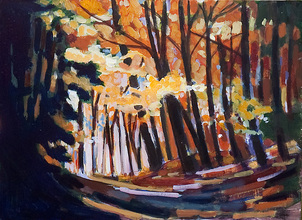
I don't always explore new ground with a painting. In the following case, a number of people asked me to paint a larger version of the original sketch, which I did, without trying for anything new. It was accepted into the Quest Spring Juried show and subsequently sold. Similar, but different. 12 x 16 to 16 x 20 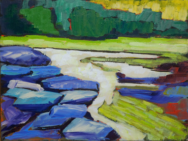
Just for fun, I also painted a scaled down version. 12 x 16 to 8 x 10 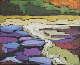
I hope these "rules" help you in your next enlargement project. Have you enlarged any of your smaller paintings? Do you have any insights you can share?
Keith Helen here. Today I'm tackling an urbanscape -- in fact the edge of a small town we drove through in Nova Scotia. I did my first pass, laying down the dark areas on a red-orange underpainting (because my initial ideas were to keep to the grey-blue colouring of the buildings, the overcast sky, and the asphalt road). The dark areas are going to tell me if I have a composition worth pursuing (I somehow forgot the entire roof on the left ). This stage happens pretty quickly. 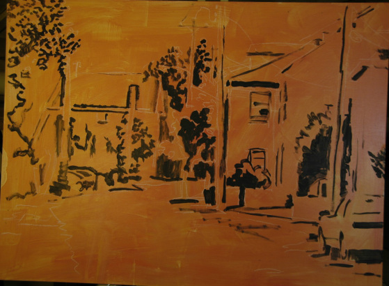
At this stage I felt I had the basics of a well composed scene. However, I saw that If I kept to the colours in my photograph, I was going to end up with a cold painting. So I decided to change the hues to warm up the overall painting. Once you have a sound structure you can (more or less) confidently change colours but not values - darks remain dark, lights stay light. My challenge here was to balance the smaller building on the left with the mass of buildings on the right. 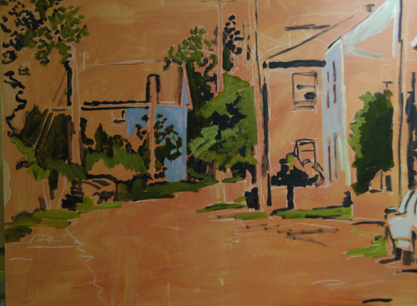
Initially, I trusted that what I fell in love with in the scene included all the major elements I saw in front of me. Eventually, it dawned on me that something's gotta give. There were way too many hydro and other posts crowding this scene. As artists, we must join the Ministry of Fallen Trees and take out elements that are not adding to the strength of our composition. That includes trees, posts and entire structures that must be taken out (or repositioned) in order to make a good painting. 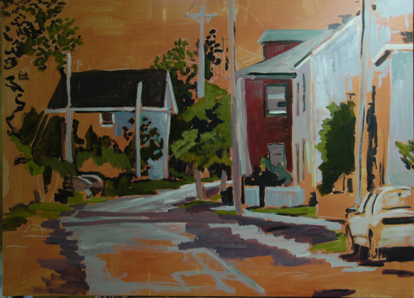
Now I had to decide which of those elements to remove. In Part Two I'll show which posts went and why, as well as how and why that house on the left got a new paint job. Back to the studio (but first, The Mentalist. Hey, Einstein said creativity is the residue of wasted time).
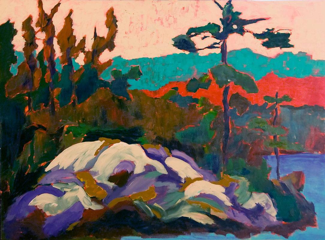
Some of my art students are struggling with (at least) two things: Finding the colours in a scene where they aren't all that apparent, and loosening up their painting style. For some reason, it's not all that easy to loosen up; I said to one person, you'd think we'd been asked to bungee jump when all we're doing is just pushing paint around on a canvas. Her friend retorted, it's more like jumping without the bungee. Yet we continue to aspire to a looser rendering, not trusting the result. 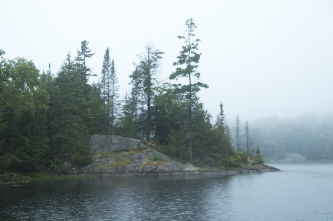 The rock and pine scene, above, faced us across the water as we set up our easels at a boat launch in Haliburton, Ontario on the first drizzly morning of A Brush With the Highlands, an annual weekend plein air festival. 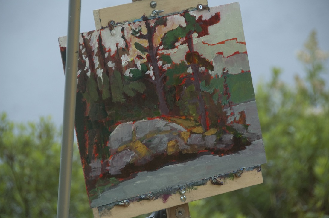 Mostly done when I took the shot, Keith's red underpainting shimmers through his shapes, giving an otherwise grey-green scene a spark of vitality and warmth, though you can still appreciate the cool, overcast elements. 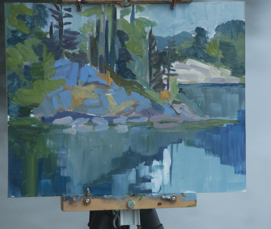 What to do? I could see that the rocks had some blue in them, so I laid down some quick blue strokes. I made the blue more intense, keeping the value correct. Working loose and fast I intensified the surrounding colours to keep in harmony with the new, more vibrant blue rocks.
To get past tightness and fussiness I find the faster I work, the better the result. However, there are times when the best plan is to walk away rather than to linger, "finishing" and "fixing". Better to say, "My work here is done" and heed the siren call of the hot chocolate at the cafe down the road. Our first plein air outing
I didn’t even know what painting "plein air" meant when we joined our first plein air class back in 2008. “En plein air”, painting in the open air. It sounds simple enough, however, it’s all very well to happily paint away in the comfort and security of our studio. It’s another thing to paint out of doors, where other people might be watching us. Talk about nerve wracking. So off we went to paint a semi-urban scene in the nearby village of Unionville. Even setting up we had spectators. “What are you doing?” Are you artists?” “See the nice man painting.” That’s all before I’ve put down the first brush stroke. Despite all this attention, I got set up and began to size up my composition. I’d always painted from my own photographs before, and I’m a pretty good photographer. I know how to crop and make a ho-hum scene something worthwhile to look at. So I was surprised at how foreign the scene in front of me felt. The objects, shapes, lines and colours all rioted in from of me. What to put down first? What was my focal point, where were the shapes a good painting depends upon? I was totally lost. After 60 minutes of chasing shapes and values around my board, I realized that I was getting nowhere. I had a representation of the scene in front of me, but not a painting. Not a piece of art, or even the beginnings of one. What to do? Bring out another board and begin again. Discipline. Paining is not simply representing the space in front of you. Look for the design within the mass in front of you. Squint at the scene to reduce it to the major shapes. Capture those shapes. What are generally the darkest bits, where are the lightest bits? Fill those in. Do it quickly because the sun is moving and the shadows changing. After a couple of hours of trying to simplify and capture the essence of the scene, I was finished. Much better than my original effort. However, something was still missing. Time to pack up, get back to the studio and discuss our day’s work with each other. Perhaps then we’d figure out where the painting fell short. ================ My Ah Ha Moment When I looked over the work I did on my first plein air painting day, I was both troubled and excited. Troubled because I knew the work was falling short in some way. Excited because it was still more powerful than the work I’d been doing in the studio. Helen and I looked over our work and worried the pieces like a pair of dogs snarling over a bone. We picked apart technique, choice of cropping, even choice of topic. Was it my colour mixing? What about my values, my composition? What’s missing? This wasn’t a simple process, and we came to no quick answer. We spent the better part of a year talking over and arguing over the missing ‘element’. Almost every piece we painted during this time fell short of the promise it made. Our skills improved, but the solution seemed as far away as ever. Then one day, we asked a question we had asked before, what was in the original scene that spoke to you? What compelled you to paint this particular scene? While we had asked these questions of ourselves many times before, this time we realized that they weren’t simple, throwaway questions. They were central to the success and failure of a painting. When we paint something because it speaks to us, and we hold that call in our minds, the results are more charged with something ephemeral, yet vital that other works don’t have. We had our answer. We were translating the scene with our paintings. Hacking away the unimportant to get to the visceral core of the matter. Our goal became to have our paintings speak the same voice the scene used to spoke to us. Keith |
Keith ThirgoodIs an artist working in the Canadian, post impressionist style. I paint en plein air when I can and in the studio the rest of the time. Archives
June 2019
Categories
All
|
 RSS Feed
