|
Since Goethe and Chevreul wrote their respective colour theories in the early 19th century, we have all been taught colour theory based upon the concept that red, yellow and blue are the primary colours. Despite the difficulty this caused artists, it has been almost universally accepted by artists. The problem with the old theory when it comes to mixing paints in the real world, it doesn’t work. (Standard theory works with optics, just not with paint pigments.) For instance, in the old theory, red and green are complementary colours. In other words, they are opposite to each other on the old colour wheel. Being opposite to each other, when mixed, theory says, they should cancel each other out. Green should darken red and vice versa. They should mix down to a neutral black. Doesn’t happen. They produce a rather dirty brown. In fact, dirty brown is about all you get when you mix any complementary colours on the old colour wheel. Another thing wrong with the old colour wheel and these three “primaries” is that you cannot mix fundamental colours with them. Try mixing magenta out of the three so-called primaries. You can’t do it. Additionally, you are not supposed to be able to mix anything and produce a primary colour. However, if you mix a pure magenta and a clean, transparent yellow, you can get pure red. What’s going on here? The old theory and the old colour wheel simply don’t work when it comes to mixing pigments. However, there is a replacement for the old wheel that makes colour mixing easy. The new colour wheel has yellow, magenta and cyan as the primaries. These have been used in the printing industry for years. And most scientific papers relating to colour use them as the primary colours for subtractive colour mixing. These produce a far larger group of colours, in a far more predictable manner than the old colour wheel did. Mix cyan and magenta and you will arrive at blue, yellow and cyan for green, and yellow and magenta for red. Mix their complements and you get black. I’ve done my own testing and have read much research done by others like Dan Jasko (He has done a huge amount of testing. His website www.realcolorwheel.com has hundreds of pages of information.). Through all this, I’ve found that the following are the best pigments to use for the three primary colours: Cyan = Phthalo Blue, yellow shade (PB:15.3) Yellow = Hansa Yellow Medium (PY:73) Magenta = Quinacridone Magenta (PR:122) With these three pigments you can mix a wide variety of hues. However, to make mixing easier and quicker, it helps to add four more colours to a working palette: Phthalo Green yellow shade (PG:36) Napthol Red Light (PR:9) Burnt Umber (PBr:7) Indanthrene Blue (PB:60) It’s important to check that the paints you choose use the right pigment. For instance, the right magenta will use pigment PR:122. Some manufacturers will call a colour the same name as another manufacturer, however, they will use a different pigment. Add white to your palette and you have what it takes to create almost any colour. Here’s the basic new colour wheel. 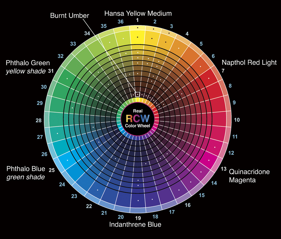 One thing to note, you cannot mix the primary yellow with its compliment and get a dark neutral. Yellow is just too light. However, there is a very handy yellow that is quite dark, and works perfectly, Burnt Umber. Mix Burnt Umber with Indanthrene Blue and you get a fabulous neutral dark. Some artists are afraid of colours like Phthalo Blue, as they are so intense. Their intensity or high Chroma is why they were chosen. The act of mixing colours almost always lowers the Chroma of the resulting colour. You cannot mix two colours to make a richer (higher chroma) colour. Mixes are always duller. So it makes sense to start with the highest Chroma colours for each of the eight colours on our palette. With these eight you can mix down to almost any other colour, but with other colours you can’t mix up to these. For example, you cannot take a Cobalt Blue and mix it 'up' it look like a Phthalo Blue. Another thing you might notice about this palette choice, they are all transparent colours. This is something else few people seem to be teaching, perhaps because they don’t know it. If you mix three opaque colours together, you tend to get mud and you certainly don’t get the richest colours. If you mix a transparent and a translucent colour, you get a near full colour mix. If you mix an opaque with a transparent you get a good mix, even a translucent with an opaque does a better job than two opaque colours. It’s all about the physics of light. Here’s a diagram of what happens (This is an approximation as the reality is too complex to demonstrate in a simple diagram.): 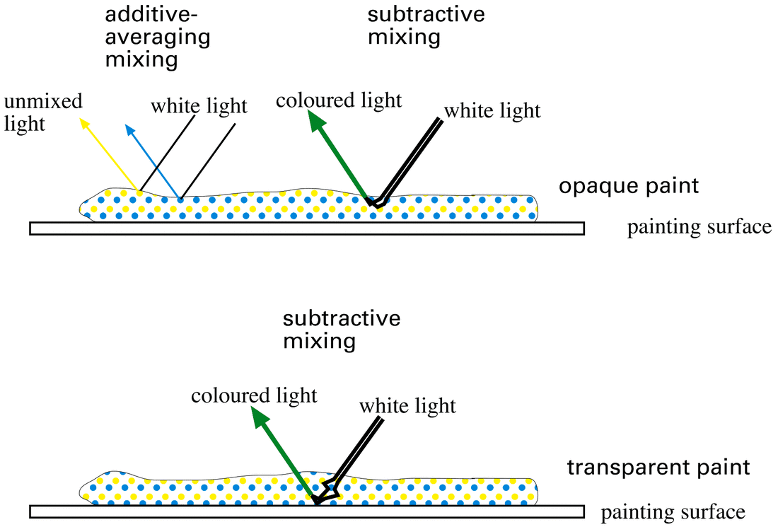 In simple terms, with opaque paint, most of the light bounces around near the surface of the paint layer interacting with the various pigment molecules and exits, as it should, as a mixed colour. This is subtractive mixing. However a fair amount of light simply hits one or the other of the pigment molecules on the top of the paint layer and reflects back at the viewer unmixed (in what is called additive-averaging mixing). This lightens the perceived value of the paint, making it next to impossible to mix really dark colours or neutral blacks.
With transparent pigments, the light passes through the entire depth of the paint layer, bouncing around amongst the pigment molecules and exits again, completely mixed. Very little of the incoming light bounces back from the top of the paint layer, which means that almost all light coming off the paint is full of colour with little reflected, additive-averaging light. This allows for much denser, darker colours, including neutral blacks. This same phenomenon seems to be at the root of the problem of “mud”. When opaque colours are used to mix new colours, as soon as you bring in a third colour, or you use a multiple pigment colour, the odds are stacked against you producing a “clean” colour. With transparent pigments, you have a much wider latitude of mixing choices, which helps you avoid creating mud. I’ve also found that using the new colour wheel to guide in selecting harmonic paintings works as well as the old colour wheel. You can still do complementary, analogous, triadic and all of the other harmonies you used under the old system, just with new colour sets. I haven’t had time to try all harmonic sets, however, those that I have tried seem to work. No limited palette can produce as many colours as are produced by modern paint manufacturers, and certainly not the wide range of colour in nature, however, for those wanting to work with a limited palette that they can learn to control easily, the new colour wheel and its palette are a great place to start. If you want to purchase a colour wheel, the only commercial product I’ve found that comes close to showing the correct relationships is the CMY colour wheel available in some art stores. You can also visit www.realcolorwheel.com and download one of Dan Jasko’s colour wheels. (You have to print it out on high quality photo paper on a good inkjet printer or it won’t be of much use.) I give each of our students the opportunity to purchase one of these colour wheels when they finish one of our workshops or classes. You can find out about classes at www.wilsonstreetstudios.com. I have been using this palette since around 2012. The new colour wheel and palette seems to be catching on beyond a small group of practicing artists, as even the paint manufacturer Golden has come out with a paint set they call “Principal 8 Color Mixing – Modern Theory”. It contains the same set of colours that I have been using, teaching and promoting for a number of years. The only difference is that their Anthraquinone Blue is opaque whereas Indanthrene Blue by Liqutex is transparent. (Known under both names in oil.) Give the modern colour theory a try and you might find it opens new possibilities for your art. Author: Keith Thirgood, Wilson Street Studio, Markham, Ontario. Keith is a Canadian landscape artist whose work is inspired by the post-impressionists, Group of Seven and a number of modern painters. His work can be found at www.wilsonstreetstudios.com. He is also president of the Ontario Plein Air Society (OPAS), www.ontariopleinairsociety.com.
8 Comments
In August, I'm heading out with a number of artists on a plein air painting adventure. We’re taking canoes and paddling into the backcountry of Kawartha Highlands Provincial Park. Which one of you hasn’t had the desire to canoe into the woods, set up your easel and paint just like Tom Thomson, AY Jackson and the rest of the Group of Seven did 100 years ago as they first ventured into the backwaters of Algonquin Park? Here's your chance to paint en plein air the way Canadians first did it, rather than in the gentle fields of Provence, the way the Europeans had been doing.  Our adventure begins when we all meet at the Long Lake entrance to Kawartha Highlands and load our canoes. I supply the canoes, life jackets and basic safety kit and each artist supplies their own camping kit. (I can help individual artists rent or purchase various pieces of equipment if they don’t have their own.) I'm an experienced camper and canoeist, and am available to help less experienced artists deal with the backwoods.  We paddle a couple of kilometres down Long Lake until we reach the Buzzard Lake portage. We take the 300 metre portage to Buzzard Lake and then continue paddling until we reach our campsite. That evening, after supper, we have a discussion on plein air painting, composition and what we all hope to gain out of the retreat. The next morning, after we each prepare our breakfast and lunch for the day, we head off in our canoes to the first painting location. Some of us will paint from our canoes; others will set up on land.  The first morning I will lead a colour mixing exercise where you will become familiar with the reduced modern palette I've recommended.
I will help each artist with subject selection, finding the order out of the chaos of a “real scene” and how to capture the essence of a scene in a few deft strokes. Each day brings new scenes to capture and new lessons to absorb. Learning, adventure, camaraderie. A perfect four-day outing for the adventurous artist. If you want to be one of those artists, visit this page on our website for more information. Helen here. I like to keep a journal when we go on trips. As this was an exploratory trip in preparation for our Kawartha Highlands Art Retreat, it was even more important. We drive northeast from Markham. It’s only a couple of hours, not so far compared to many of our retreat destinations. We make a left onto Long Lake Road down to Long Lake Lodge. Here we pick up our rented canoe and begin to load our supplies and kit for the painting trip. This is the same place we will be meeting the participating artists in our August 6 through 10 art retreat. 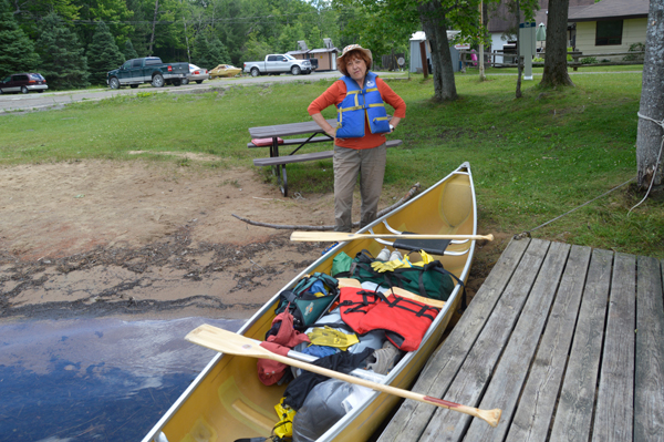
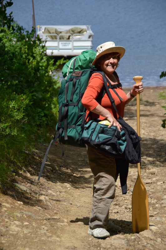
Helen at launch site. Canoe packed and ready to go.
Once our packs are in, we push off and begin paddling west along this stunning lake. Rocks rise massively on one side and islands dot the surface. It takes us just over an hour, going at a leisurely rate to make it to the portage to Buzzard Lake. 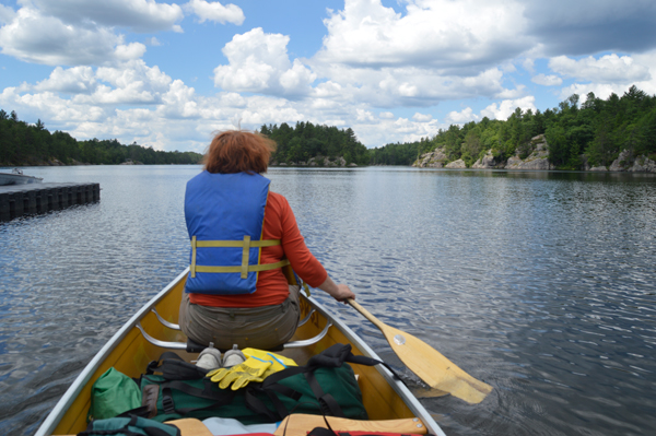
Pushing off onto Long Lake, Kawartha Highlands Provincial Park.
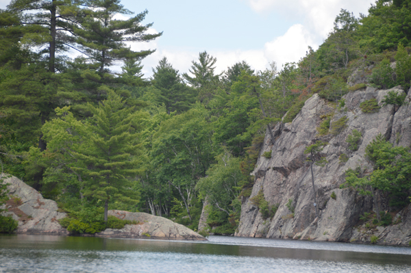
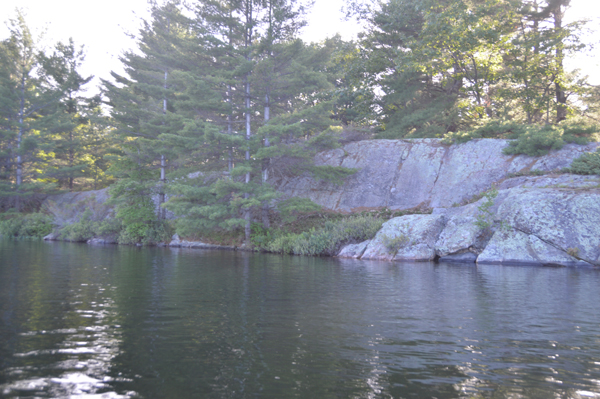
Fantastic cliffs
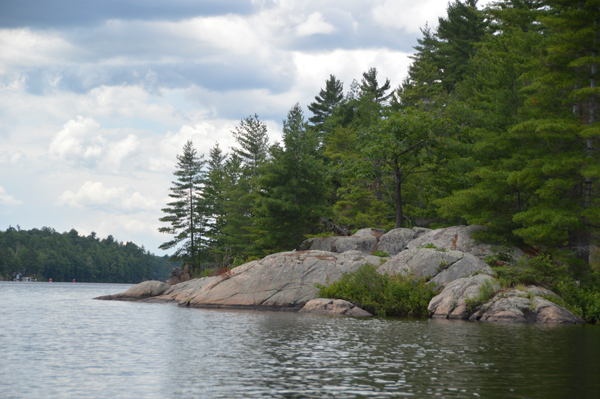
Great places to paint already.
Along the 340 metre portage between Long and Buzzard lakes we meet Bonnie and Doug who are kayaking. They’re from Pickering, but teach music in Markham. They helped us lift our canoe onto Keith’s shoulders and he carries it, over his head, over the length of the portage. It’s only 10 minutes in each direction; we go back and forth twice, (plus the extra time we took chatting [resting] with the teachers.) Compared to Algonquin portages, this one is smooth and easy going.
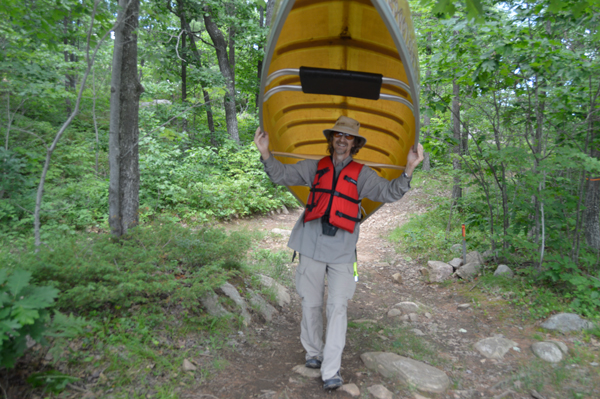
Keith portaging canoe.
Also, compared to Algonquin, the scenery here is more spectacular for the most part. Algonquin tends to be green on green. Here there are so many lovely rock faces, it totally transforms the scenery. 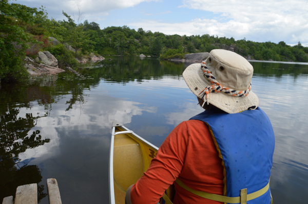
Heading off onto Buzzard Lake.
More great scenery.
By 4 pm we arrive at our campsite on Buzzard Lake. It was fairly simple to get our canoe up onto dry land and start to unload. Our two-man tent is new (they’re lighter and cleverer these days) so Keith is spending a few minutes going over instructions. Sometimes it seems the odd shapes make no sense, but it comes together like some magical plan. Meanwhile, until he needs me, I’m unpacking the food and medication. It may be a campsite, but there’s a homey aspect to the organization. I doubt A.Y. Jackson lived like this in his month-long stay in a tent after the Indian guide dropped him off. I had this image of roughing it, but this is mighty civilized. 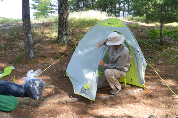
Keith setting up new tent.
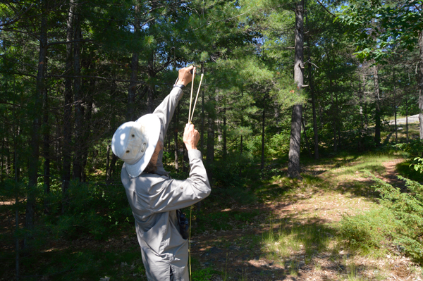
Keith using his slingshot to get a rope high into the trees.
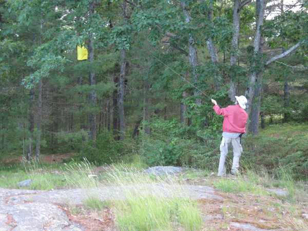
Hauling the food up into the trees.
By 5:40 we’re eating cheesy noodles, pre-roasted chicken slices, and a salad of cherry tomatoes and cucumber slices. Good to have some fresh food at the start. Keith did a lot of research and shopping before we started this trip, so we have, among other things, triangular-shaped nesting bowls (outer for entrees, inner ones, insulation-lined and lidded, for tea.) Remind me to bring instant coffee next time. Even the instant variety is better than none at all. The instant skim milk tastes better than it used to. Dessert is herbal tea, chocolate wafers and trail mix. 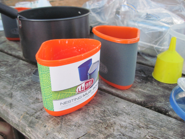
Clever nestling cups and bowls.
Earlier, as we paddled, and now, sorting things out at the site, we’re treated to squalls of rain – nothing that lasts long enough to cause concern. The sky is mostly patches of blue. The lake water is warm (I know because I’m washing dishes in it). 6:30, dinner is finished. Dishes done and hanging in the net. Food hung up in a tree. The sun is still up, and there’s time to paddle around and see what we can find for subject matter. What we find are more potential scenes than we could possibly paint if we had two weeks to do so. 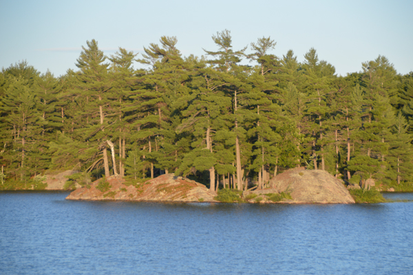
More painting potential.
9:00 pm, not really dark, however, time to build a fire. This one, to Keith’s chagrin, took him 4 matches. The wood was dampish, but it’s done and he’s now carving he’s a walking stick as the fire roars. Fire. Loons. So Ontario. 9:50, crawling into sleeping bags in the tent. Ziploc bags are godsends. They keep things together, dry, you can see everything and they float. I’ve just had an idea, I’m going to plan ahead for next time and pre-measure all of our containers and tools. Pots, mugs, ladle, etc. What holds a tablespoon, a cup, quarter cups, etc. This means I don’t have to lug around extra items for measuring. 9:00 am. No rising at the crack of dawn for this pair. We were both too baffed. Breakfast is cereal with skim milk. Lunch will be freshly scrambled eggs and pre-cooked bacon wrapped in a pita. Eggs in shell are nature’s perfect packaging. Kept them in a stiff plastic container. Loons are yodeling, Keith is washing dishes, this is perfect. Finding our toothbrushes in with the art supplies is pretty terrific (thank goodness!). Now we’re off to find some more places to paint. 11:00am and we’re on an island, set to paint another island that has magnificent boulders and Casson-like pines. A.J. would have painted this if he’d seen it. Everywhere we turn, another potential painting confronts us. When we come back in August for the full retreat, we’ll have more time to try out the many possibilities. 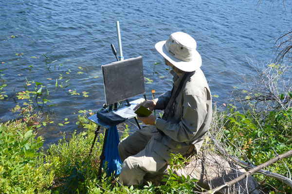
Keith sitting on a rock at water's edge, ready to paint.
Five young guys are taking turns jumping off two levels of a nearby cliff. Their cries of trepidation and triumph are infectious. This is what northern lakes are for – and painting. We watch a big ant with a piece of scrambled egg three-times his size racing off with his prize. We finish our paintings and then we’re off, exploring the rest of the lake. 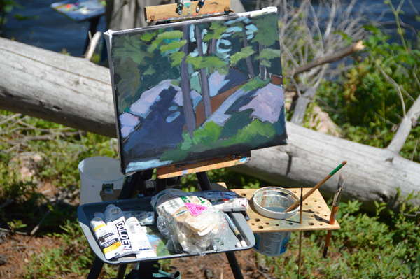
My first painting of the day.
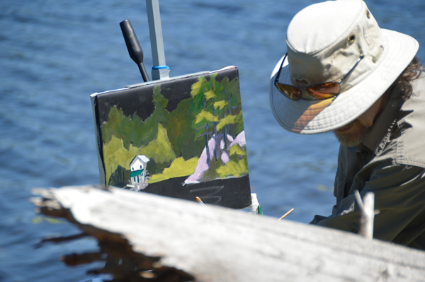
Keith half way through his first painting of the day.
At one end of the lake we see this weird illusion of the water ending in mid air. Closer inspection shows it to be a log jam where the water seeps through to a rocky, river bed. We had to get down there. Risking twisted ankles and who knows what else. 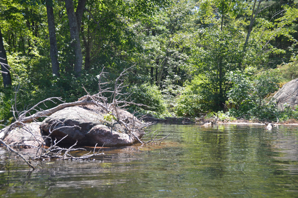
The lake falls off the edge.
Keith is very agile. I am much less so. But we are both attracted to rocky places, it seems. So, not much smarter than teen-age boys, we descend into the rocks and moss and broken branches in the dimly lit woods. Lived to tell the tale. 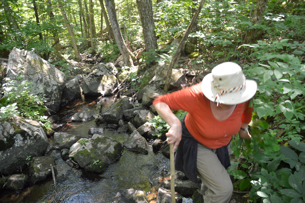
Helen scrambling deep in the rocky gully.
Swamps are equally seductive. But mosquitoes live there, and we’re not that intrepid. Back at the camp, near the tent, there’s a small woodpile. From it, weird grunting sounds come in fairly regular intervals. Good thing we don’t watch spooky movies. Eventually, Keith figured it out. Grubs. They chew the wood very loudly. I’m the cook, but Keith is the kitchen magician, keeping stoves lit, pots boiling and the fire roaring. Once a boy scout, always a boy scout. I was going to make couscous, but forgot the oil. So it’s Sierra Chicken in a foil bag. Edible. However, regular ramen soups are better and cheaper. We had figured out our portage weight allotment and from that I figured out what we could carry in the way of food. Two things we realized: We can carry more, split into two bags. Not such a big deal doing the portage. It’s a short one and it doesn’t take long once we’re paddling again to get to the site, so timing is not frantic. And, two, I way over estimated how much we’d be eating. Second morning. Our last day. Must leave camp by 10am if we’re to make it back by 4 or 5 pm tonight. This time, up early. Took longer to pack than expected. Suddenly there’s a shift in the light and we see whole new painting possibilities present themselves. While Keith considers the re-packing of the tent (very different exercise from unpacking), I grab a quick sketch. Then it’s serious packing and into the canoe and off again. 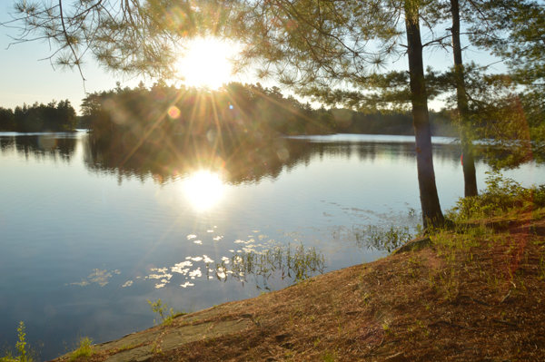
The light changes and another potential painting appears.
The portage back was interesting in that we met two park wardens. They help us by pointing out where the local waterfalls are. 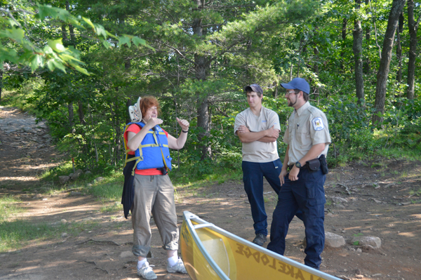
Helen and the two park wardens.
On the longer paddle down Long Lake, the wind whipped up the water suddenly. Paddling got a bit more challenging. In spite of that, we made it back in record time and before we knew it, we were on the road (12:10), driving home in gorgeous weather, taking the side roads, wanting to be home again but not just too soon. Our conclusion: Kawarth Highlands Provincial Park is a great destination for plein air painters, especially those from south/west Ontario and from the GTA. It’ a fraction of the distance compared to Algonquin. Algonquin has the history and romance, Kawartha Highlands has proximity, accessibility and scenery. And we conclude that even with painting supplies adding to the weight, it’s not too hard and new canoeists and new painters will have a good time trying out Kawartha Highlands Provincial Park. 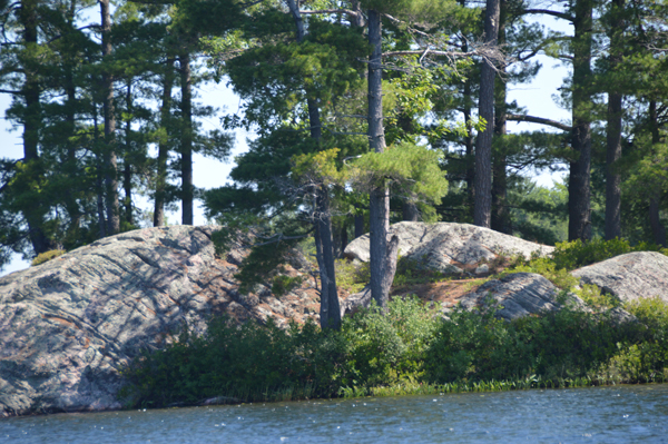
Another painting ready to be painted.
A number of artists have asked us where we got our special, plein air easel set up. When I tell them that I built it, they all want to see plans. To respond to all those requests, I've put together a PDF, which goes through all the steps or building your own field easel. 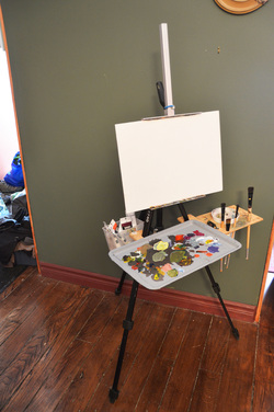 This easel requires some basic woodworking and metalworking skills, however, nothing advanced.
You need to be able to measure, saw wood and metal, drill, file and glue with epoxy. The most complicated thing is tapping threads. This easel works for both oil and acrylic set ups. The instructions are for the acrylic set up. To modify the set up for oil, you don't bother to use the magnets, as your palette will not be metal, and you adjust the length of the hold-down clip to suit your preferred palette. Also, you need to adjust the large opening in the brush and cleaner flap to fit whatever liquid holder you use. Click here to download a PDF (2 MB) that has complete instructions to build this set up. Click here to download a PDF that shows the oil solvent cup holder modification. We've often been asked what an artist should to bring when going plein air painting. Not that easy to say, as we are all so different, however, I can say what I bring. (This is for acrylic painting.)
First, you need to control your selection of paint. Depending upon how far I expect to walk with my kit, I bring either a bare minimum palette of colours, or a slightly expanded set. Bare minimum set Hansa Yellow Medium Napthol Red Light Quinacridone Magenta Burnt Umber Indanthrene Blue Titanium White Expanded set Hansa Yellow Medium Napthol Red Light Quinacridone Magenta Burnt Umber Indanthrene Blue Phthalo Blue (green shade) Phthalo Green (yellow shade) Titanium White Polymer medium With either of these two paint kits, you can mix almost any colour you come across. Two brushes: Catalyst by Princeton Polytip bristle 1" & 1/2" Brights (great brushes for plein air, if you like stiff, easy to control brushes) Palette: Non-stick baking tray Field easel (I have my own custom-made easel) or pochade box with tripod Yoghurt tub for cleaning brushes Rags for cleaning brushes Viewfinder Small sketchbook 1 soft pencil Eraser Grey-scale markers: black, medium and light non-bleed markers 1 small spritzer bottle for keeping the paint on the palette open Clamp-on umbrella to shade painting board and palette 3-4, 12x16 (or whichever size you like to work with) painting boards for the day, already primed orange or black Stool (If you paint sitting down) Backpack large enough to carry all of the above except the boards, which I carry in a board holder Water for painting, if you will not be near a water source Camera to shoot scene and capture progress of your painting Non-Painting Items Sun hat Sunscreen Insect repellant Drinking water Snacks Sweater or similar in case it turns cool Rain gear if there's chance of rain Pliers, for opening stuck paint tubes Good walking shoes Cell phone for emergencies If you are going deep off the regular track, these other items are good to have as well Compass and/or GPS Food & more water Whistle for signalling Basic first aid kit Walking pole Map of area Space blanket 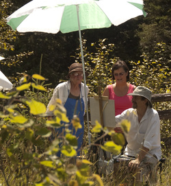 The following are ten steps I encourage all of our students to consider as they paint.
Cheers, Keith Thirgood www.wilsonstreetstudios.com Composition is an interesting subject. When you read some books, they delve into the exceedingly complex compositions of the old masters showing circles, lines, boxes and overlapping structures they believe underpin these great works. Showing you this is meant to help you with your own painting, although I've never met anyone who found them all that helpful as a beginner. At the other end of the spectrum, we've seen and read art instructors who's compositional vocabulary is such that if you take them at face value, almost any work can be shown to have one compositional factor or another. I think, for most of us, composition should be our servant, not our master. We need the tools of composition to keep us out of trouble and to make our paintings stronger. These tools can be ignored, when we're ready to step off the edge without their aid. The goal of any composition is to lead the viewer's eye around the painting, having it pause where we want it to and then move on to explore more of the painting. While there are many possible compositional skeletons or armatures, I'm going to describe the armatures I feel are most useful. 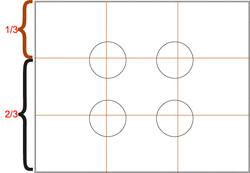 One third, two thirds. Using this helps you stay away from the trap of a "symmetrical", boring painting. The circles represent the "ideal" focal points. 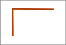 "L" shape. This simple, common armature usually produces a strong, stable work. As with most of the following armatures, the L can be almost any size and start and finish almost anywhere in the painting. It doesn't have to have its corner in the upper left. 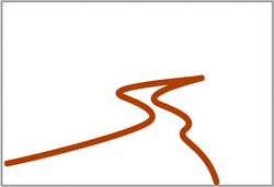 "S" shape. A favourite of landscape painters, the S leads the viewer deep into the painting, and automatically creates eye movement. 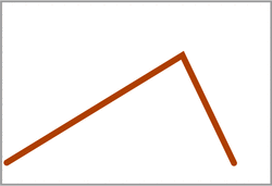 "V" shape. The V can lead the eye quickly to the focal point (more on focal point later), although, handled sloppily, it can trap the viewer at the focal point and not let them explore further. 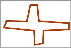 The "Cruciform" shape. A more complex compositional form, this can be used to produce very powerful and stable work. 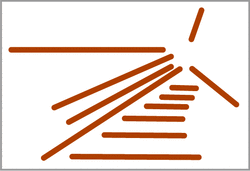 "Radiating Lines". Can work well, however, without other elements in play, it can trap the viewer at the focal point. 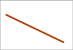 "Diagonal". Another useful compositional tool, that needs care to use. Without modifiers, a strong diagonal can shoot the viewer right off the page. 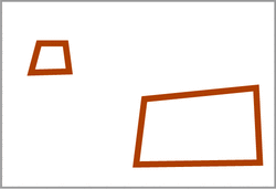 "Fulcrum". This is about creating visual balance. Big vs little. Near vs far. I mentioned focal point. Not all paintings have one, but many, if not most of the successful ones do. It's the place of greatest interest. It's where you want the viewer to end up looking and where they get their "reward" for looking. It's up to you to determine where you want the focal point to be, and then to use the tools of composition to bring the viewer's eye to that point and reward it. It's helpful if it's the point of greatest contrast, most detail and sharpest edges. In the 1/3 - 2/3 example above, I've circled the spots where it's safe to put your focal point. As you get more comfortable, you can take greater risks and put your focal point almost anywhere you choose. It just becomes that much harder to create a painting that works, when you abandon the "safe".
When you are sizing up a scene to paint, using your hands or a cropping tool, starting cropped tightly at your focal point, widen your crop until you've found the right cropping to support your focal point. Then look at the elements of your scene. Do a quick value sketch to determine if the scene has potential. Then look at the sketch for compositional possibilities. Is there a natural, obvious composition? How can you emphasize the compositional elements that are already there? What do you need to modify in the scene to create a better composition? Figure it out in the sketch before you begin to paint. Take stuff out, put stuff in, move stuff around. You're not a camera, you're an artist. Make the best painting you can, don't simply make a record of what was there. Cheers, Keith Thirgood www.wilsonstreetstudios.com P.S. This is part of what artists who attend our Art Retreats get to learn and practice en plein air. We hear this question from our students, fellow artists and each other all the time. Since we've been teaching, and during our own growth as painters, we've found that the answer to this fits into one or more of five general reasons.
Whether you're working from nature, a still life or from a photograph, you need to observe carefully. Good observation requires time and contemplation. Many artists arrive at a location, take a quick look, set up their easels and begin to dive into their painting. Walk around your subject, or if a photo, use cropping "ells" to explore different crops. Get to know your subject. Figure out what draws you to it. Look at the colours in isolation. Determine how the scene is constructed. Make sketches. Once you know what you're painting, observation doesn't stop. For every 30 seconds you spend applying paint to your surface, spend 60 to 90 seconds observing your subject. Next time I'll deal with composition. I've been on the hunt for juried art shows and juried Art in the Park style events. I've spent so much time on it, I've neglected our blog. So I decided to post what I've found in our blog. I invite you to add shows that you've heard of, where there is still time for members to sign up for.
With some of these shows, you have to join the organization hosting them, however, that's often not a real barrier. Sometimes the shows have a restricted geographic barrier. If there are any restrictions that you know of, please mention them when you list a show. If I come across any more, I'll add them to the post. artcetera 2013 Elora Centre for the Arts (ECFTA) http://www.eloracentreforthearts.ca APPLICATION DUE MARCH 8 Beaux Arts Brampton juried show http://beaux-artsbrampton.com APPLICATION DUE MARCH 8 Stratford Art in the Park http://www.artintheparkstratford.com/applicants.php APPLICATION DUE March 15 Sunnyside Beach juried art show (art in the park style)http://www.artinitiatives.ca/sunnyside/home.html APPLICATION DUE MARCH 31 Judith and Norman Alex Art Gallery https://www.jnaag.ca/about/call-for-entry-juried-art-show Application due April 4 (South west Ontario residents only) Aurora Annual Art Show & Sale http://www.town.aurora.on.ca/aurora/artshow April 15 however, once all spots are taken no more are accepted. Blue Mountain Foundation for the Arts http://www.bmfa.on.ca/applications.html APPLICATION DUE April 5 or 6 Quinte Art Council Expressions http://www.quinteartscouncil.org/events/expressions/expressions.html Due April 8 Warkworth Art in the Park http://www.warkworthartinthepark.ca/call-for-entries/ APPLICATION DUE April 12 Jazz It Up juried art show Whitby Jazz it Up APPLICATION DUE April 15 or 17 in person Art in the Park Oakville http://www.artintheparkoakville.com/apply_to_aip.html APPLICATION DUE APRIL 25 Art in the Park Petrolia http://www.artintheparkpetrolia.com/htm/vendor_app.php ASAP Schomberg Village Street Gallery http://svsg.ca/ APPLICATION DUE May 13Art in the Park Sarnia http://artintheparksarnia.com/?q=application/application-fees June 1 or as soon as all space is filled Art in the County held in Picton, Ontario http://artinthecounty.com/ APPLICATION DUE June 14 Uxbridge Art in the Park http://www.uxbridge.com/lionsart/ APPLICATION DUE August 1, however as soon as they have enough artists, they close applications I welcome you to add to this list. Cheers, Keith Thirgood President OPAS www.wilsonstreetstudios.com |
Keith ThirgoodIs an artist working in the Canadian, post impressionist style. I paint en plein air when I can and in the studio the rest of the time. Archives
June 2019
Categories
All
|
 RSS Feed
