|
Composition is an interesting subject. When you read some books, they delve into the exceedingly complex compositions of the old masters showing circles, lines, boxes and overlapping structures they believe underpin these great works. Showing you this is meant to help you with your own painting, although I've never met anyone who found them all that helpful as a beginner. At the other end of the spectrum, we've seen and read art instructors who's compositional vocabulary is such that if you take them at face value, almost any work can be shown to have one compositional factor or another. I think, for most of us, composition should be our servant, not our master. We need the tools of composition to keep us out of trouble and to make our paintings stronger. These tools can be ignored, when we're ready to step off the edge without their aid. The goal of any composition is to lead the viewer's eye around the painting, having it pause where we want it to and then move on to explore more of the painting. While there are many possible compositional skeletons or armatures, I'm going to describe the armatures I feel are most useful. 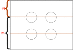 One third, two thirds. Using this helps you stay away from the trap of a "symmetrical", boring painting. The circles represent the "ideal" focal points. 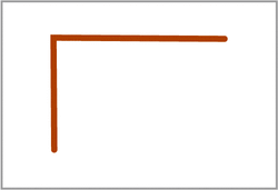 "L" shape. This simple, common armature usually produces a strong, stable work. As with most of the following armatures, the L can be almost any size and start and finish almost anywhere in the painting. It doesn't have to have its corner in the upper left. 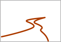 "S" shape. A favourite of landscape painters, the S leads the viewer deep into the painting, and automatically creates eye movement. 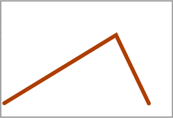 "V" shape. The V can lead the eye quickly to the focal point (more on focal point later), although, handled sloppily, it can trap the viewer at the focal point and not let them explore further. 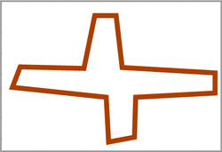 The "Cruciform" shape. A more complex compositional form, this can be used to produce very powerful and stable work. 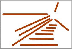 "Radiating Lines". Can work well, however, without other elements in play, it can trap the viewer at the focal point. 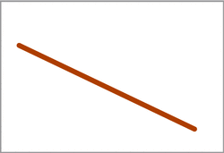 "Diagonal". Another useful compositional tool, that needs care to use. Without modifiers, a strong diagonal can shoot the viewer right off the page. 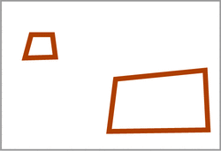 "Fulcrum". This is about creating visual balance. Big vs little. Near vs far. I mentioned focal point. Not all paintings have one, but many, if not most of the successful ones do. It's the place of greatest interest. It's where you want the viewer to end up looking and where they get their "reward" for looking. It's up to you to determine where you want the focal point to be, and then to use the tools of composition to bring the viewer's eye to that point and reward it. It's helpful if it's the point of greatest contrast, most detail and sharpest edges. In the 1/3 - 2/3 example above, I've circled the spots where it's safe to put your focal point. As you get more comfortable, you can take greater risks and put your focal point almost anywhere you choose. It just becomes that much harder to create a painting that works, when you abandon the "safe".
When you are sizing up a scene to paint, using your hands or a cropping tool, starting cropped tightly at your focal point, widen your crop until you've found the right cropping to support your focal point. Then look at the elements of your scene. Do a quick value sketch to determine if the scene has potential. Then look at the sketch for compositional possibilities. Is there a natural, obvious composition? How can you emphasize the compositional elements that are already there? What do you need to modify in the scene to create a better composition? Figure it out in the sketch before you begin to paint. Take stuff out, put stuff in, move stuff around. You're not a camera, you're an artist. Make the best painting you can, don't simply make a record of what was there. Cheers, Keith Thirgood www.wilsonstreetstudios.com P.S. This is part of what artists who attend our Art Retreats get to learn and practice en plein air.
11 Comments
Rose Ann Vita
12/16/2013 06:52:12 pm
Thank you, Keith, for this post. It is easy to understand, and is a great reminder for me of your summer art retreat.
Reply
8/21/2014 02:08:53 am
The information and the aspect were just wonderful. I think that your viewpoint is deep, it’s just well thought out and truly incredible to see someone who knows how to put these thoughts so well. Good job!
Reply
9/2/2014 11:12:24 pm
Hi this an interesting article. You have described very well. Really descriptive post you have shared with us.
Reply
9/26/2014 07:11:26 pm
Awesome information. I am really surprised with this topic. Keep up the good work and post more here to read.
Reply
10/24/2014 06:47:29 am
Hi this an interesting article. You have described very well. Really descriptive post you have shared with us.
Reply
10/26/2014 04:21:38 am
I am very happy to be here because this is a very good site that provides lots of information about the topics covered in depth. Im glad to see that people are actually writing about this issue in such a smart way, showing us all different sides to it. Please keep it up. I cant wait to read whats next.
Reply
11/12/2014 01:35:59 am
Thank you for this article. I'm glad accesses the net this stuff works and your article has really helped me from beginning to end. And to share with you my thoughts.
Reply
11/28/2014 12:24:47 am
I am very happy to be here because this is a very good site that provides lots of information about the topics covered in depth. Im glad to see that people are actually writing about this issue in such a smart way, showing us all different sides to it. Please keep it up. I cant wait to read whats next.
Reply
1/3/2015 01:38:13 am
Your website is really cool and this is a great inspiring article.
Reply
Leave a Reply. |
Keith ThirgoodIs an artist working in the Canadian, post impressionist style. I paint en plein air when I can and in the studio the rest of the time. Archives
June 2019
Categories
All
|
 RSS Feed
